Your ultimate shopping companion that takes you straight to your desired products.

GET STARTED
A supermarket in-store navigation app designed to help shoppers navigate and find products within a supermarket. It aims to simplify the shopping experience by providing users with a detailed map of the supermarket's layout and the best route to locate products efficiently. It saves time, reduces frustration and helps shoppers to have access to product information or take advantage of promotions within the store.
Users are seeking a highly efficient way to locate their grocery list items in order to save time and avoid frustration while shopping in the supermarket. We will know this to be true by observing the number of users who depend on our app for a seamless grocery shopping experience.
An app that allows users to navigate inside the supermarket with indications on where to find the products they are looking for. The interface will be simple and intuitive with the use of a map with the sections marked to have an overview of the supermarket's layout.
EMPATHIZE
User Research
Goals
Findings
1
To understand customers' current shopping behavior and habits.
2
To identify pain points and challenges that customers face when shopping in the store.
3
To identify which features would be most useful in an supermarket in-store navigation app.
Most of the participants goes to the supermarket 1-3 times per week.
On average, participants spend 20-30 minutes shopping.
All of them have experienced difficulties finding a product.
They would like to spend less time at the supermarket.
The majority avoid asking the staff.
The participants mostly like to create a route based on what they need to buy.
Most of the participants use note taking apps to organize groceries list.
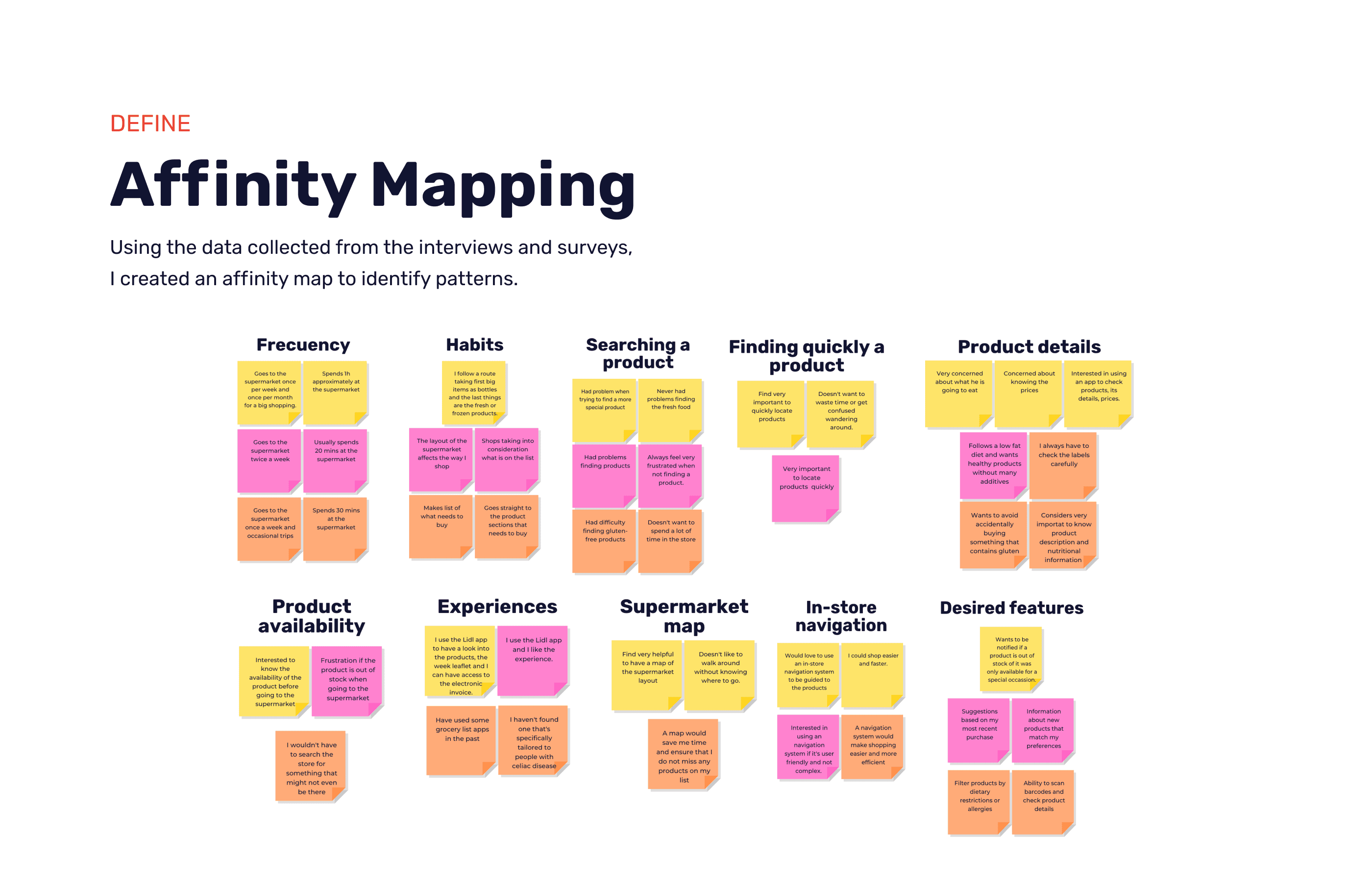
DEFINE
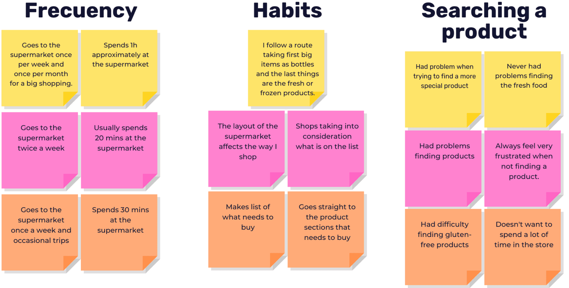
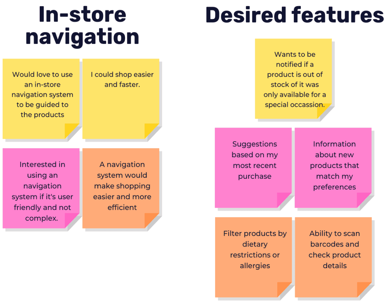
Affinity Mapping
Using the data collected from the interviews and surveys, I created an affinity map to identify patterns.


DEFINE
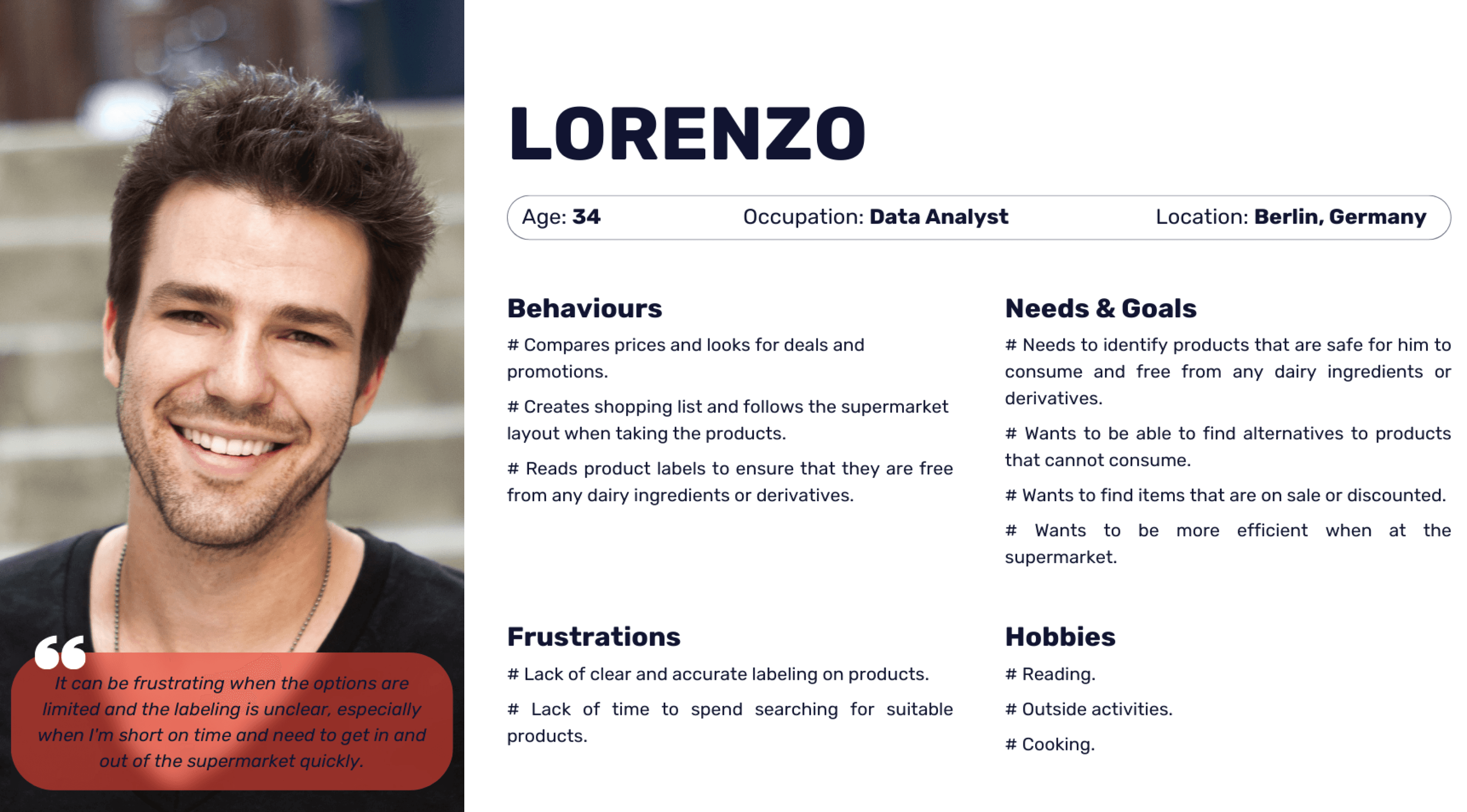
User Personas

DEFINE
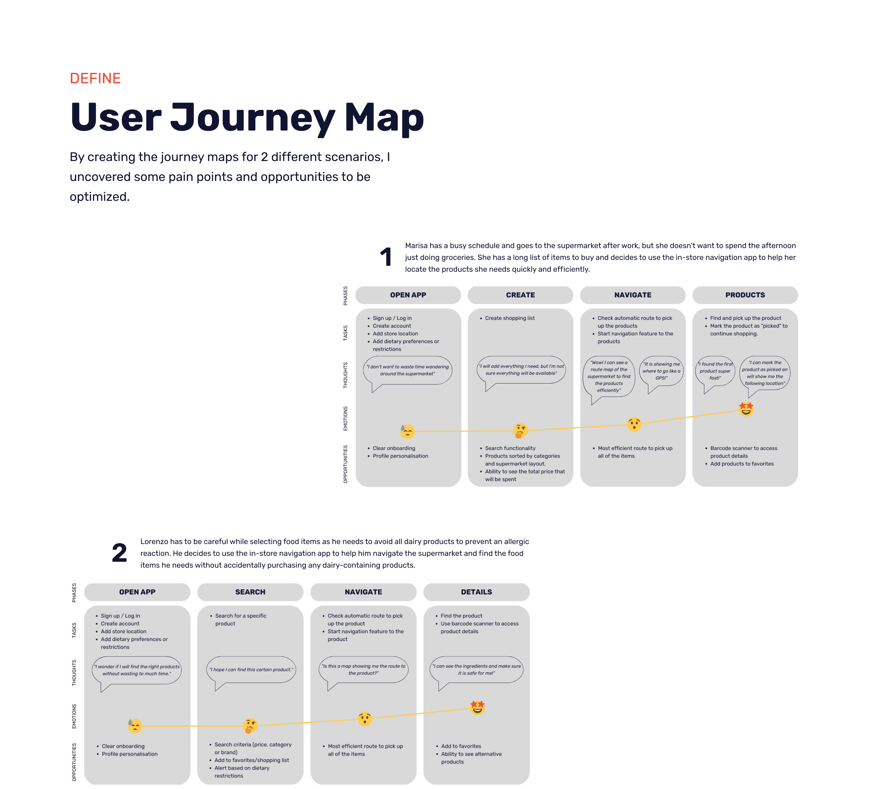
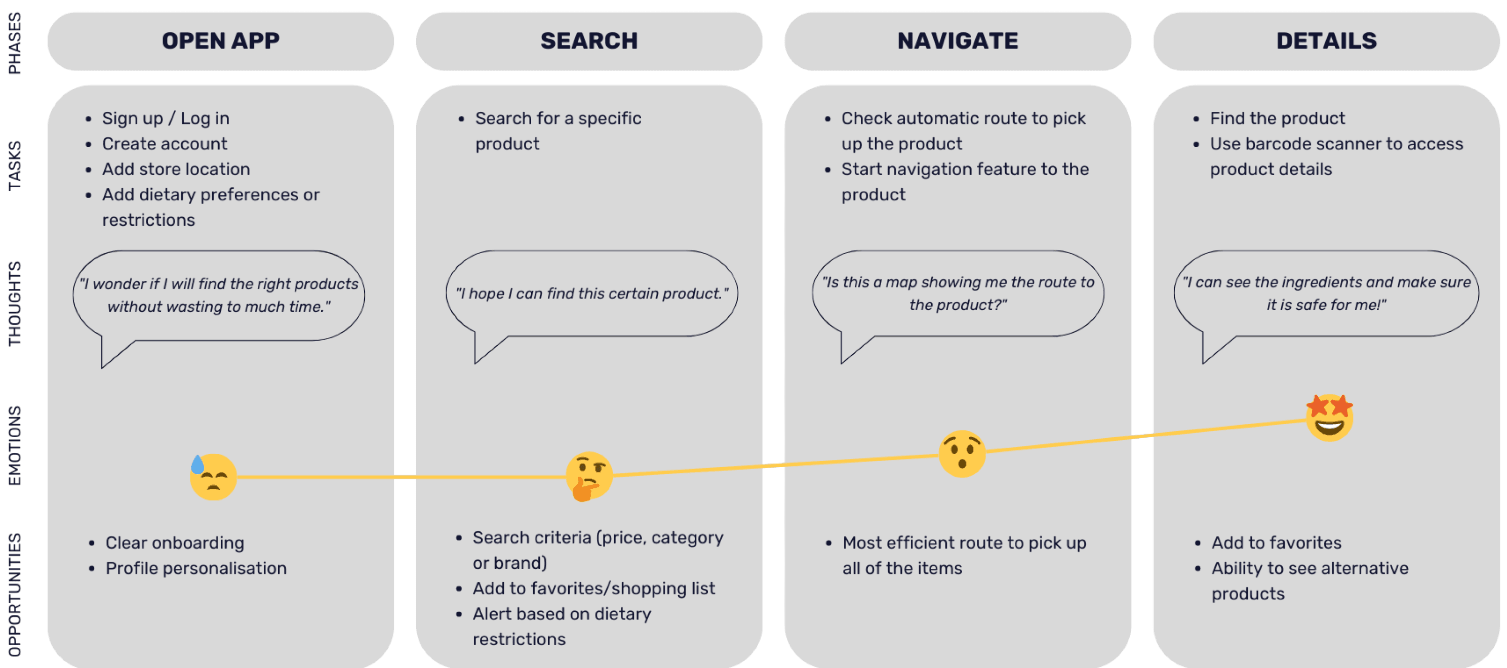
User Journey Map
By creating the journey maps for 2 different scenarios, I uncovered some pain points and opportunities to be optimized.
1
Marisa has a busy schedule and goes to the supermarket after work, but she doesn't want to spend the afternoon just doing groceries. She has a long list of items to buy and decides to use the in-store navigation app to help her locate the products she needs quickly and efficiently.

2
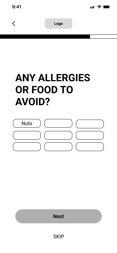
Lorenzo has to be careful while selecting food items as he needs to avoid all dairy products to prevent an allergic reaction. He decides to use the in-store navigation app to help him navigate the supermarket and find the food items he needs without accidentally purchasing any dairy-containing products.
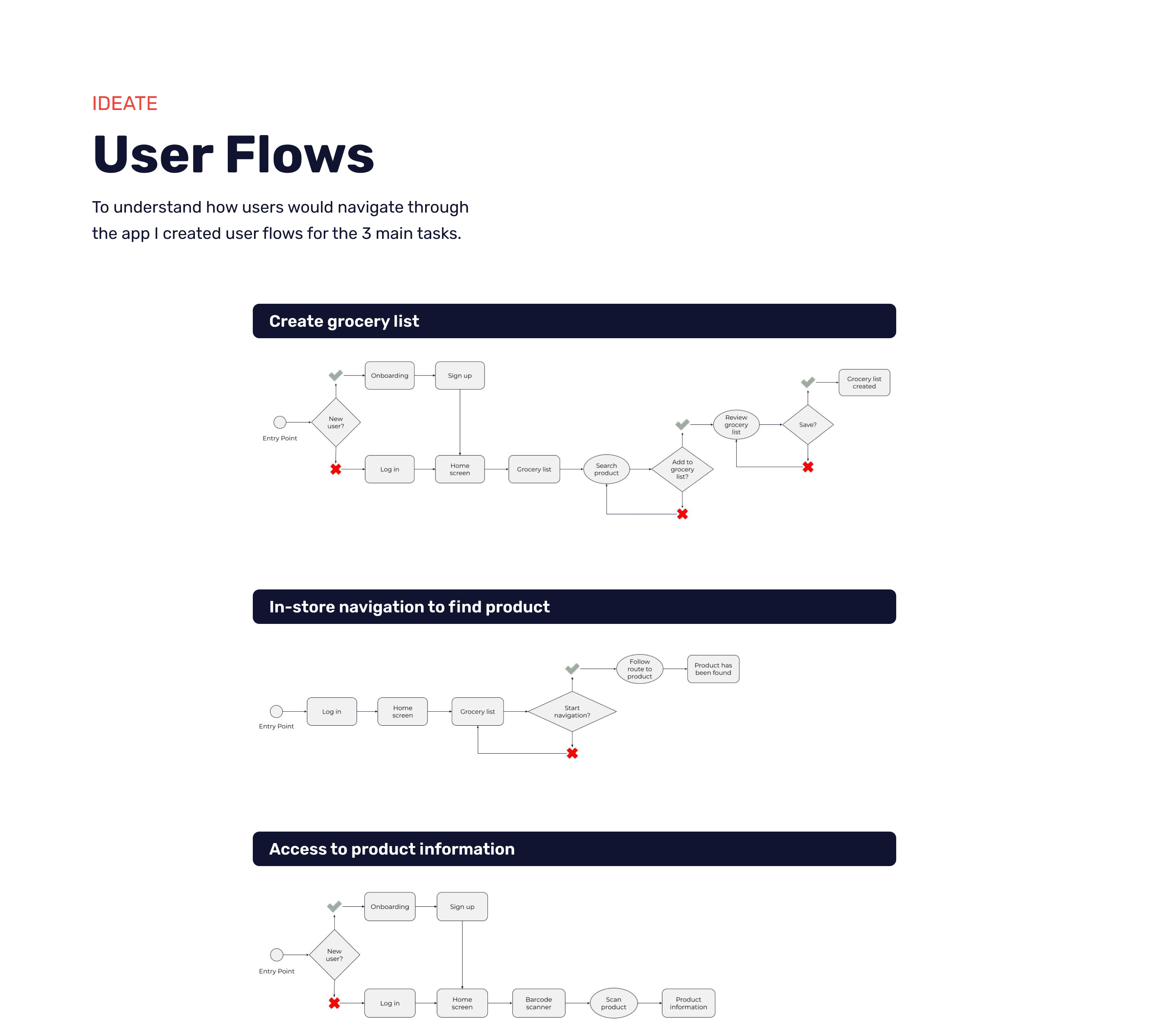
In-store navigation to find product
Access to product information

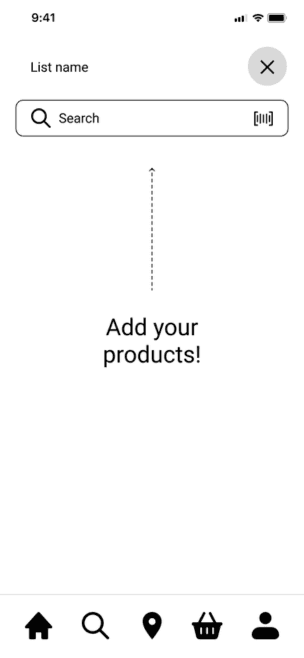
Create grocery list
IDEATE
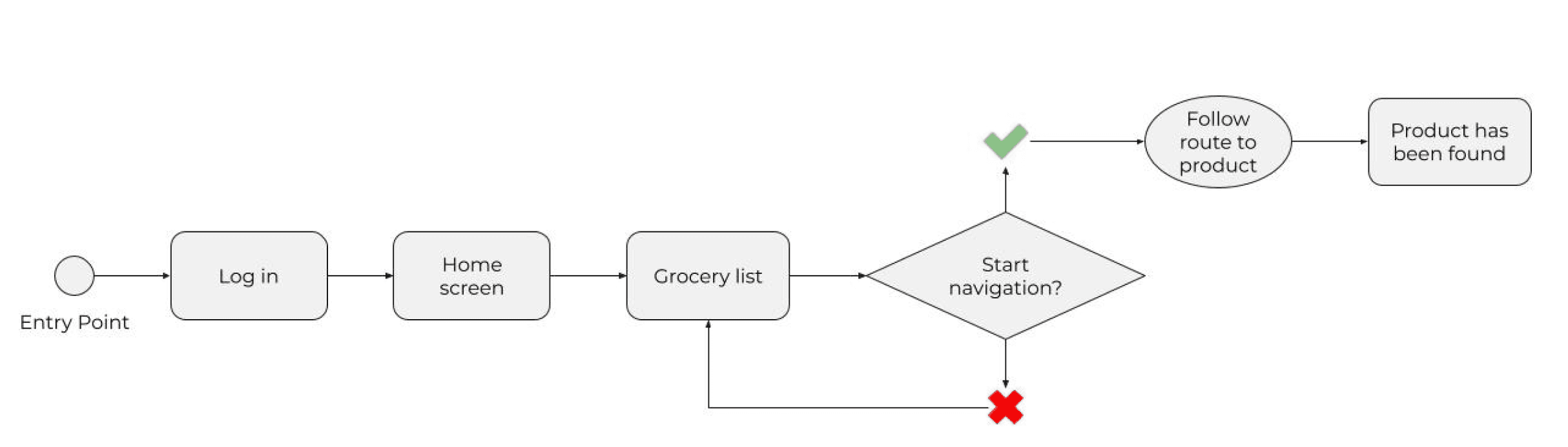
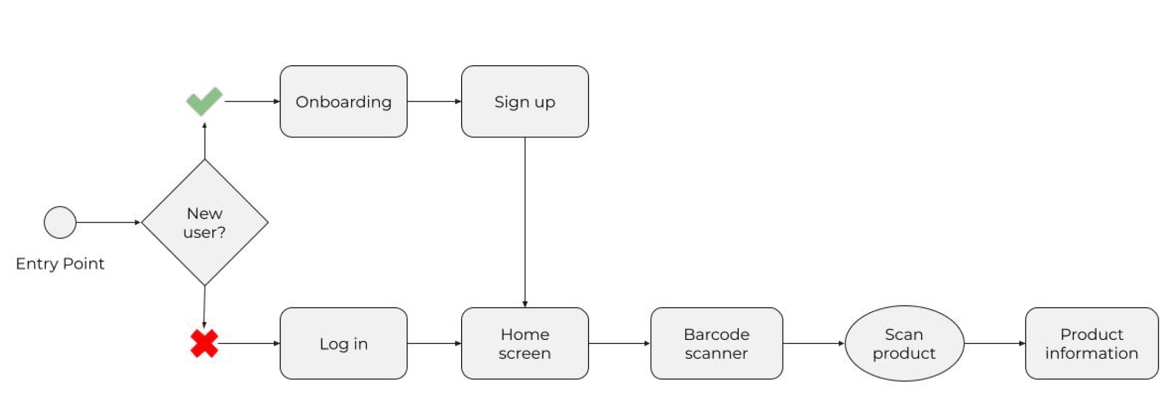
User Flows
To understand how users would navigate through the app I created user flows for the 3 main tasks.
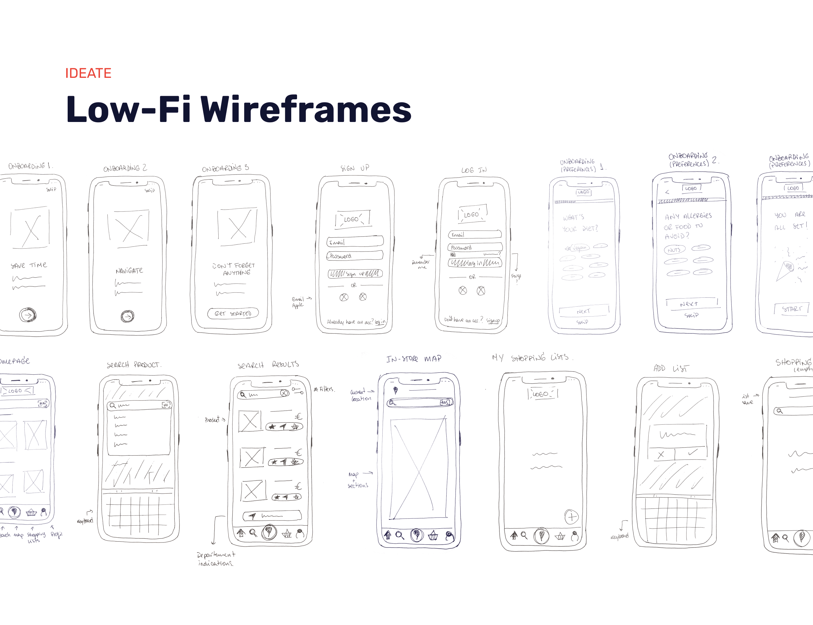
IDEATE
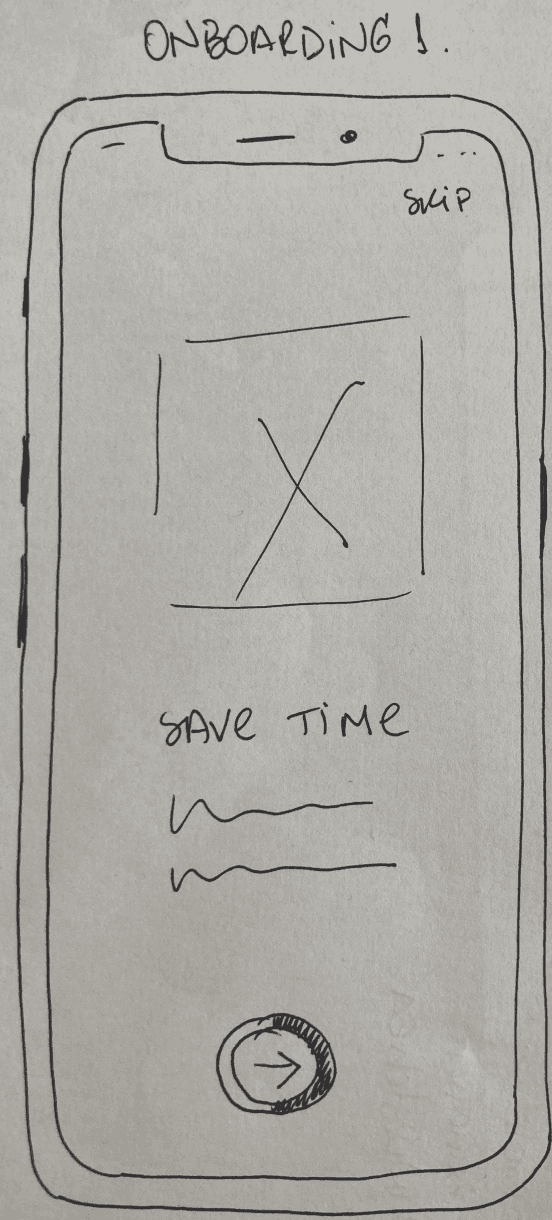
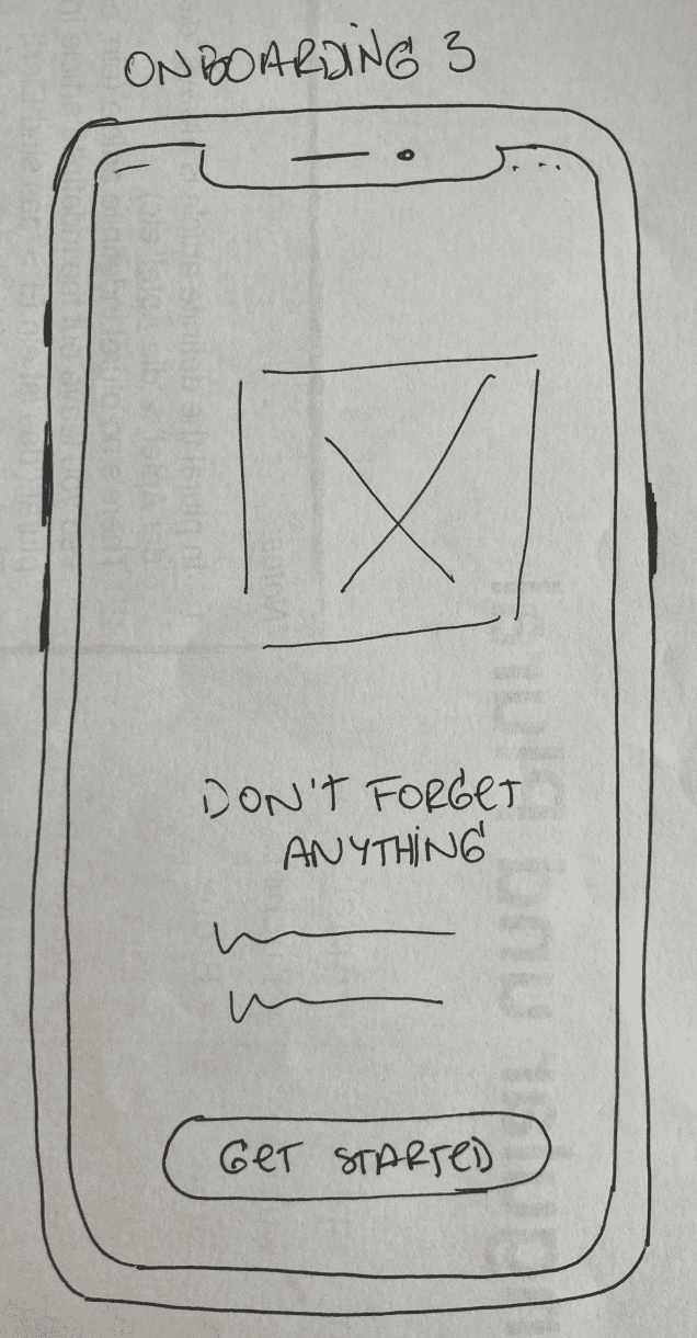
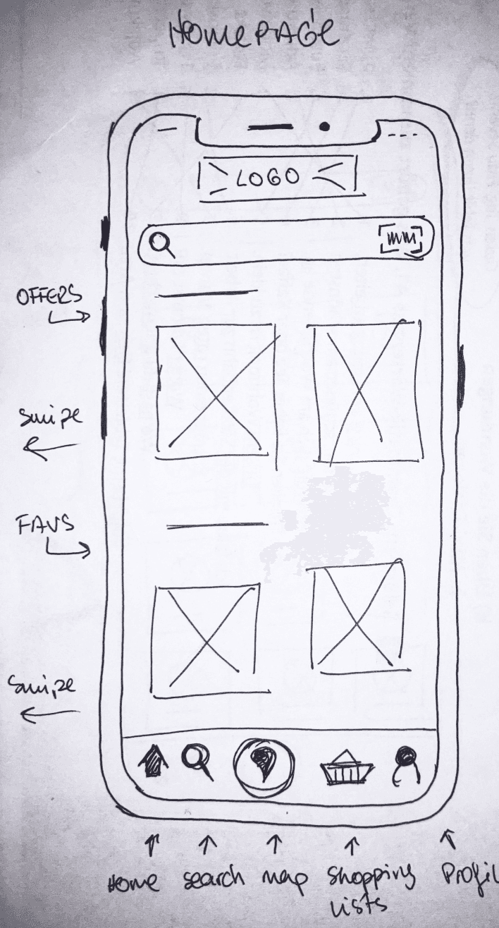
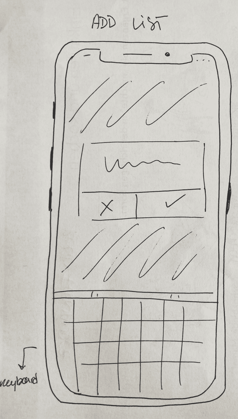
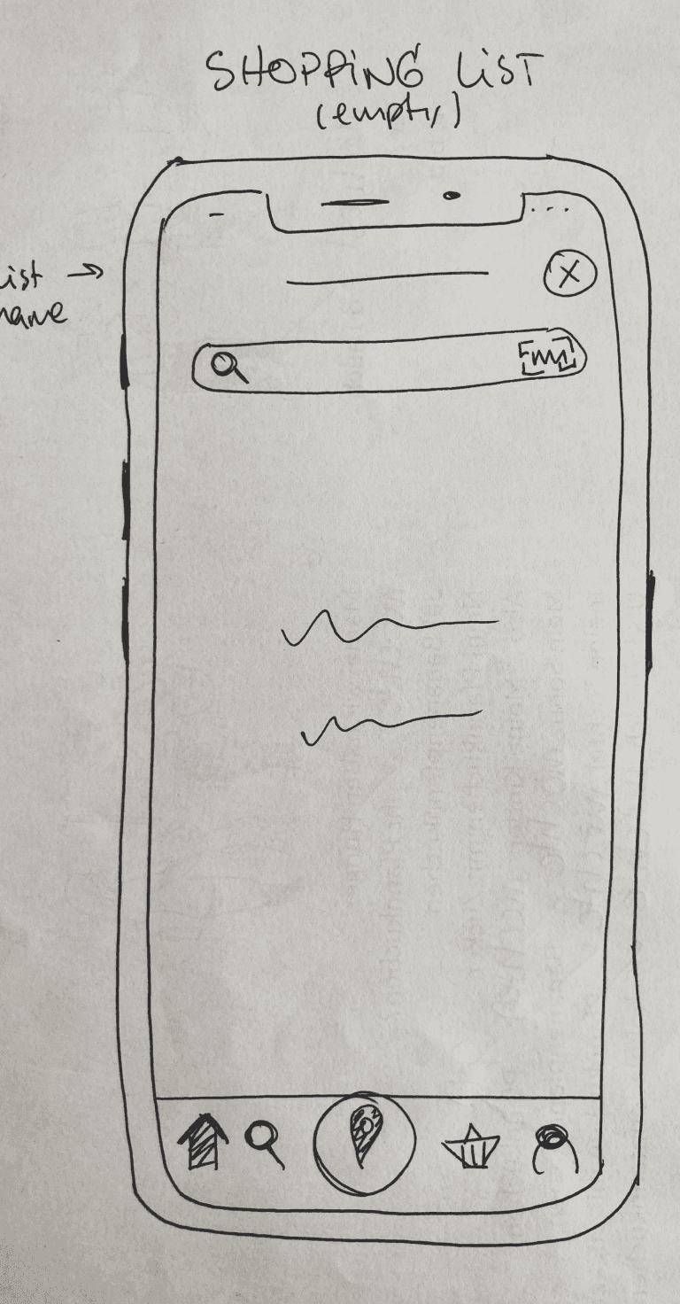
Low-Fi Wireframes


PROTOTYPE
Mid-Fi Prototype
After sketching the app idea, I transformed it into a Mid-Fi interactive prototype to later test it with the users.


TEST
Usability Test
I conducted 6 in-person moderated usability tests, which objective was to observe user interactions and collect feedback to later implement to the design.
Tasks
Issues
1
When in the supermarket, you are looking for a specific type of cheese, but you're not sure which section it is in. Use the app to search for the type of cheese you want and find its location in the supermarket.
2
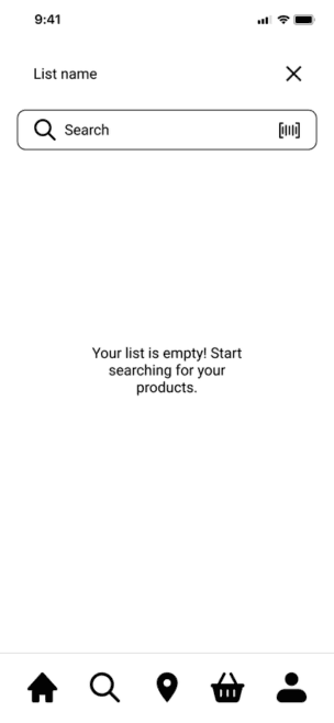
Before going to the supermarket, you want to have a list of all the products you need. Use the app to find your products and add them to a shopping list.
3
You have a long shopping list created and want to know the most efficient route to pick up the products. Use the app to get the route through the supermarket, considering all the items on your shopping list.
1
Confusion with the “+” button function

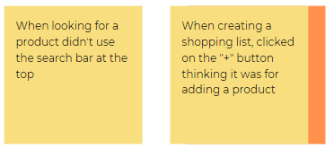
Evidence: When creating a new shopping list, the "+" button is intended to start a new list, but some users thought it was for adding products to the list.
Suggested Change: Make the text bigger to catch user's attention and add some indications.
2
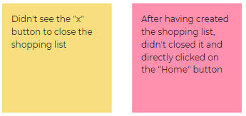
The “x” button is not visible
Evidence: Participants didn't see there is a "close" button in the right corner and once they created the list, they directly when to the homescreen or started searching for products.
Suggested Change: Make this icon more visible.
3
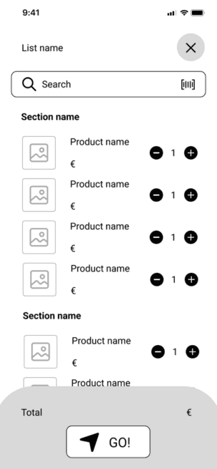
Shopping list is not sorted by sections
Evidence: Participants were confused to see all the products on the list without sections or sorting options.
Suggested Change: Add sections to the shopping list.

Observations
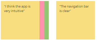
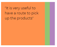
Positive
Negative
Errors


PROTOTYPE
UI & Design System
Header 1 Roboto Bold 38pt
Header 2 Roboto Regular 30pt
Header 3 Roboto Bold 25pt
Header 4 Roboto Bold 20pt
Header 5 Roboto Regular 20pt
Body 1 Roboto Bold 17pt
Body 2 Roboto Medium 17pt
Body 3 Roboto Regular 17pt
Body 4 Roboto ExtraBold 14pt
Body 5 Roboto Regular 14pt
Body 6 Roboto Light 14pt
Typography
Colors
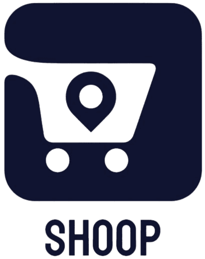
Logo
Primary
Oxford Blue
#111431
Vermilion
#EA4335
Secondary
Red
#FF0000
Gold
#FFD700
Neutral
Platinum
#D9D9D9
White
#FFFFFF


Light background
Dark background
UI Elements
Button
Button
Button
Disabled
Enabled
Home
Lists
Profile
Locate
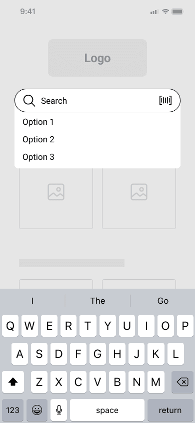
Search
Selected
Enabled
Search


Icons
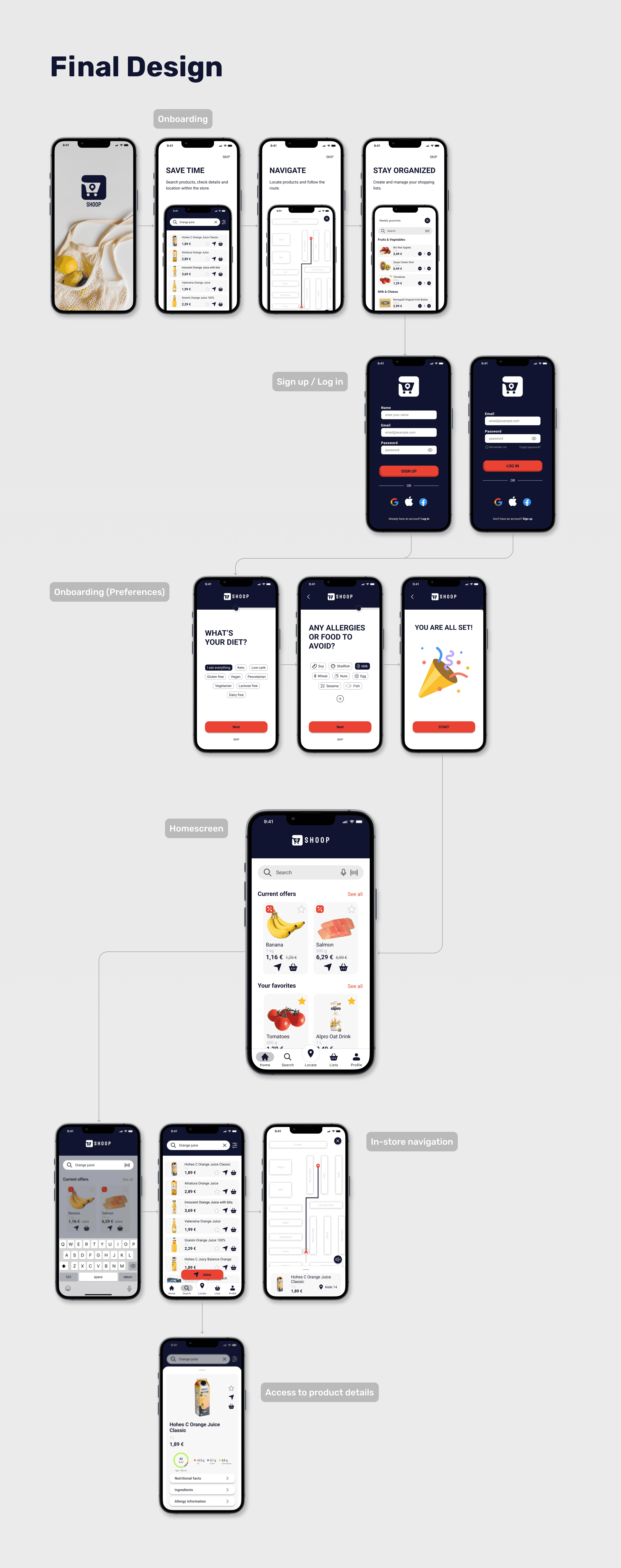
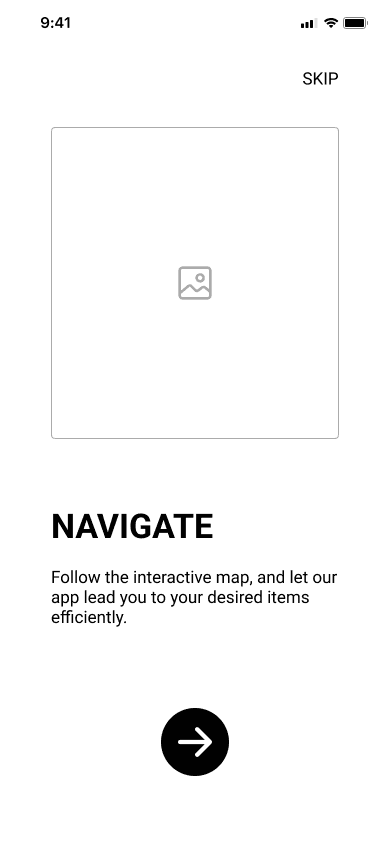
Final Design


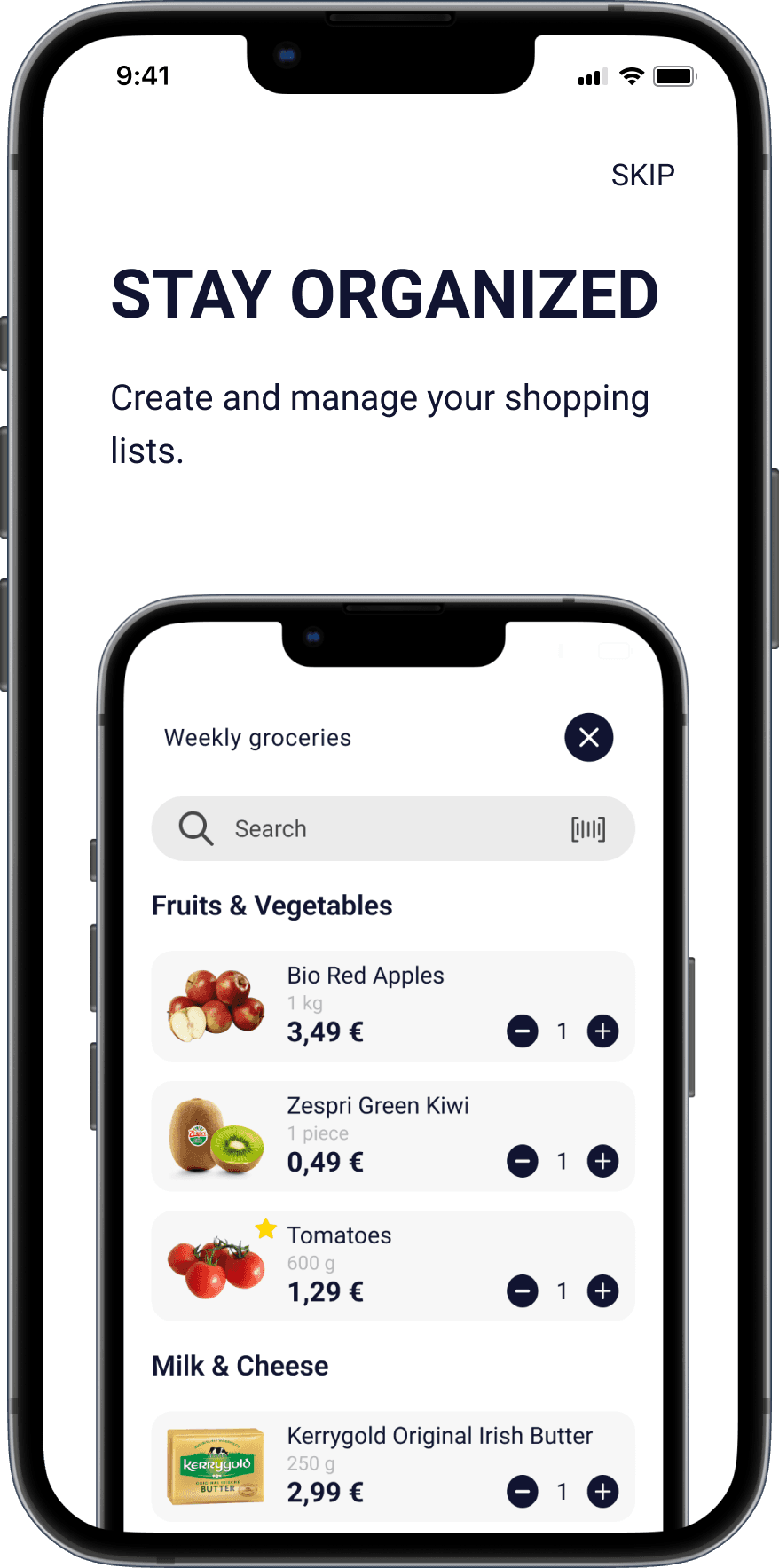


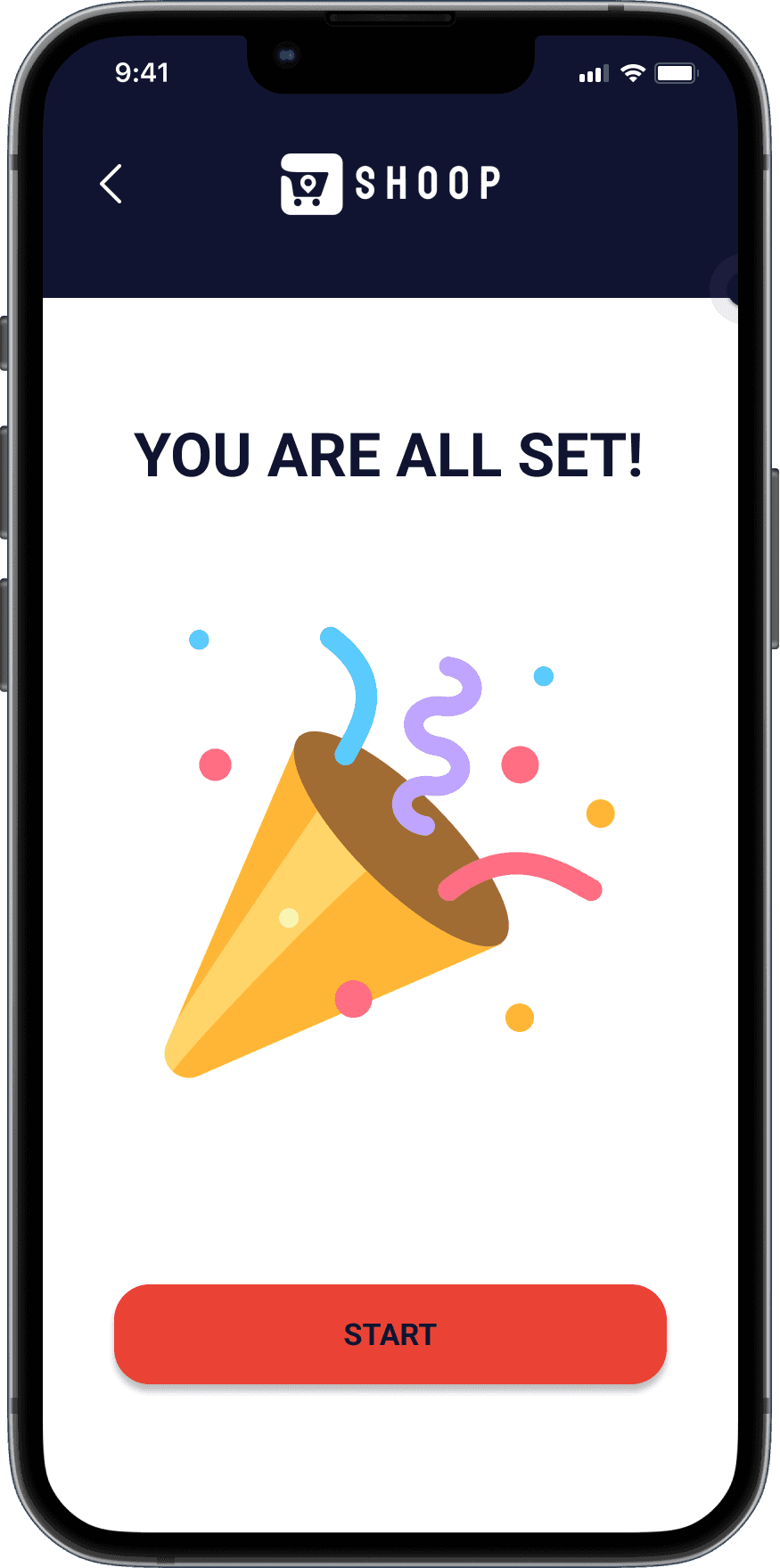


Onboarding
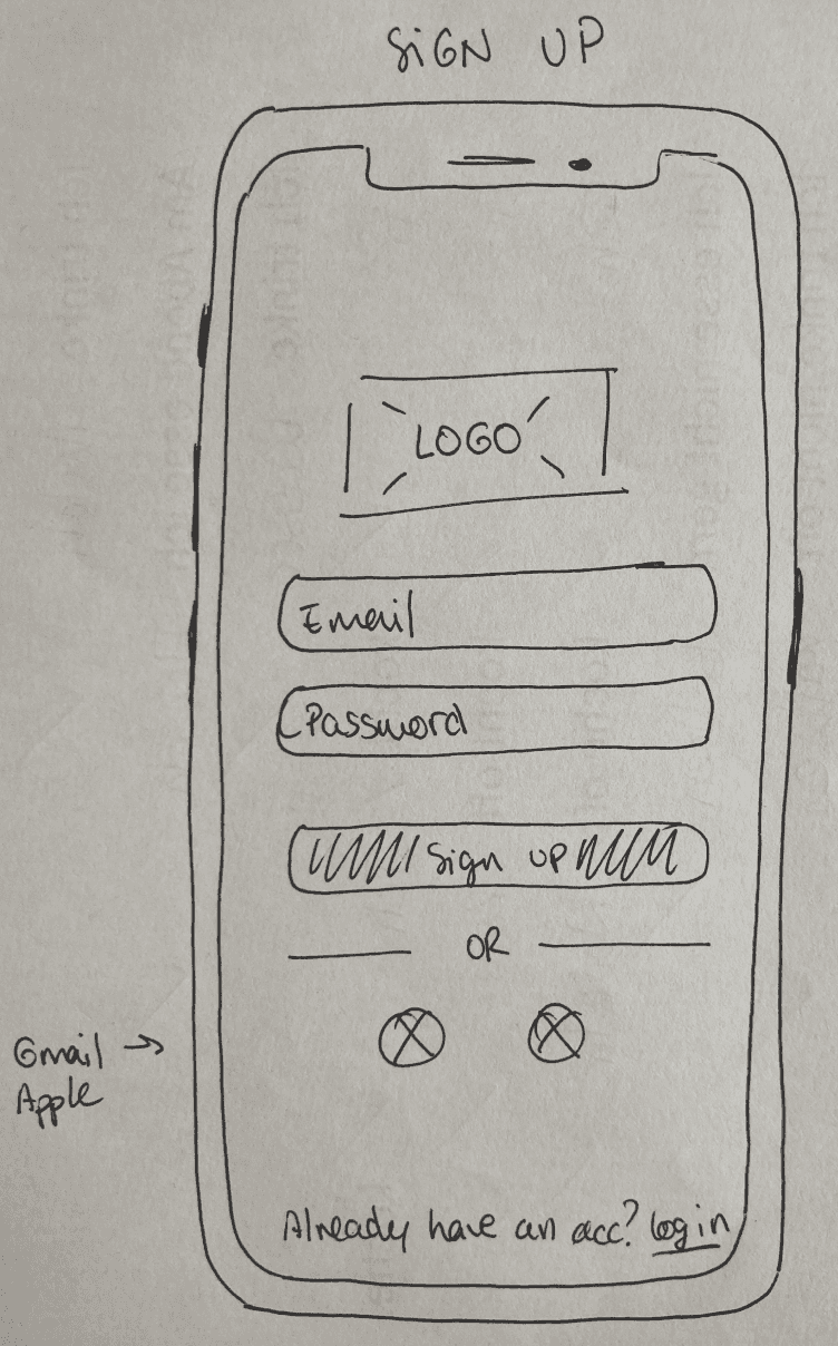
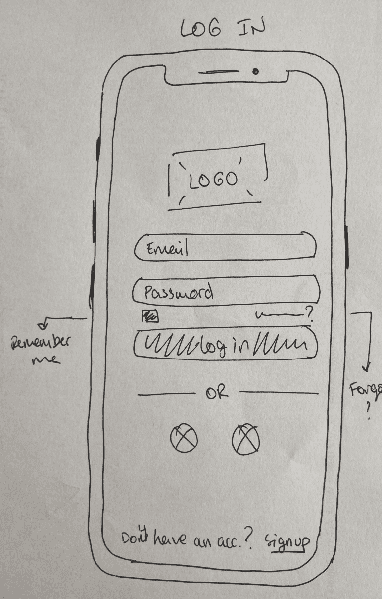
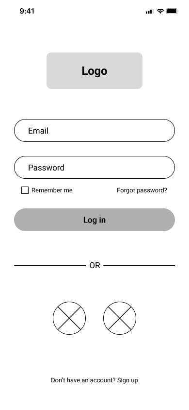
Sign up / Log in
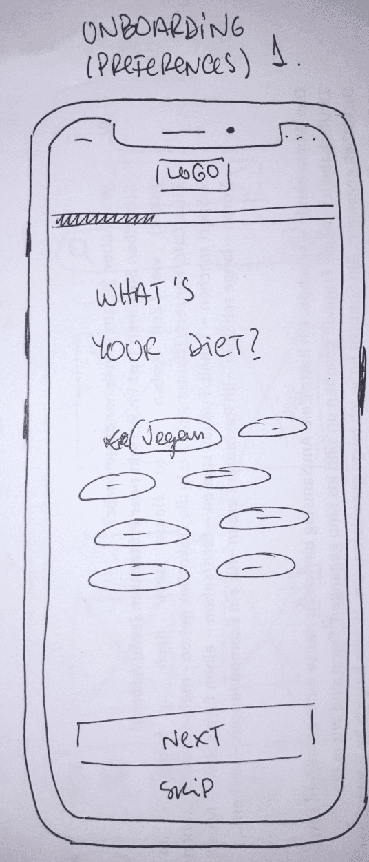
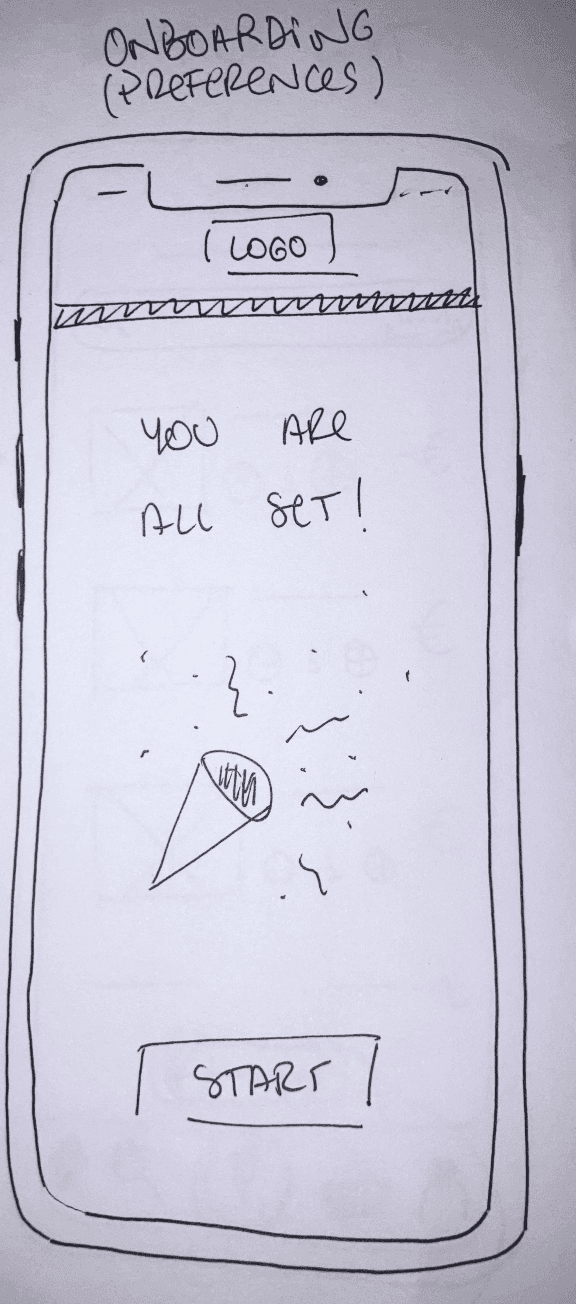
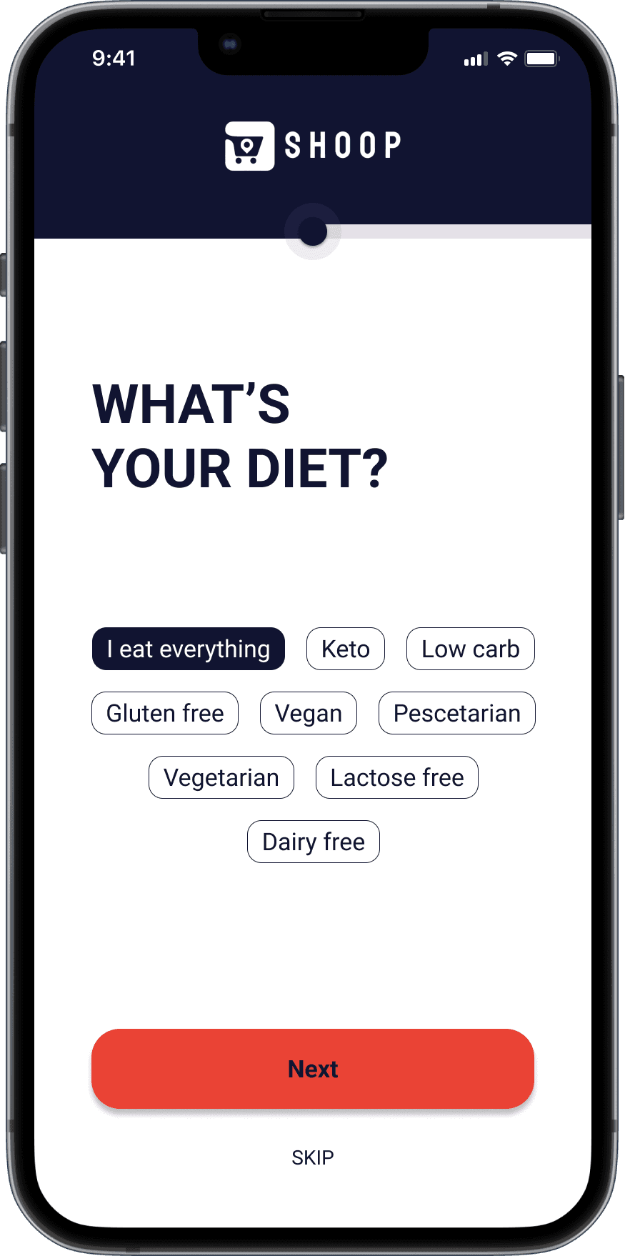
Onboarding (Preferences)
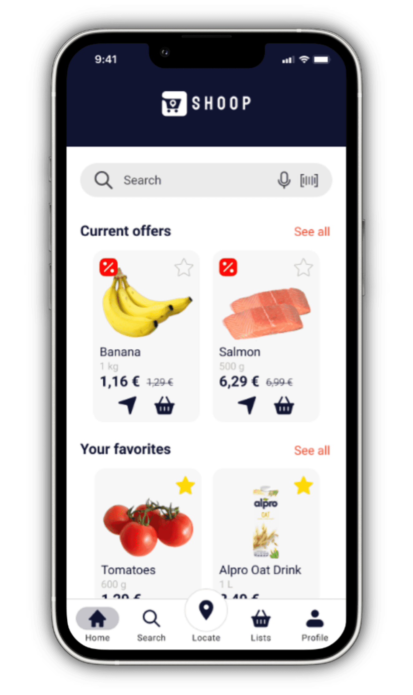
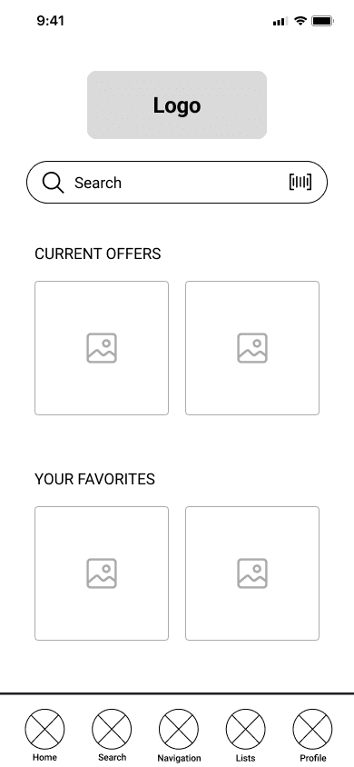
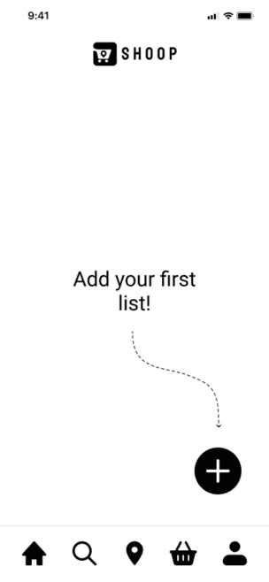
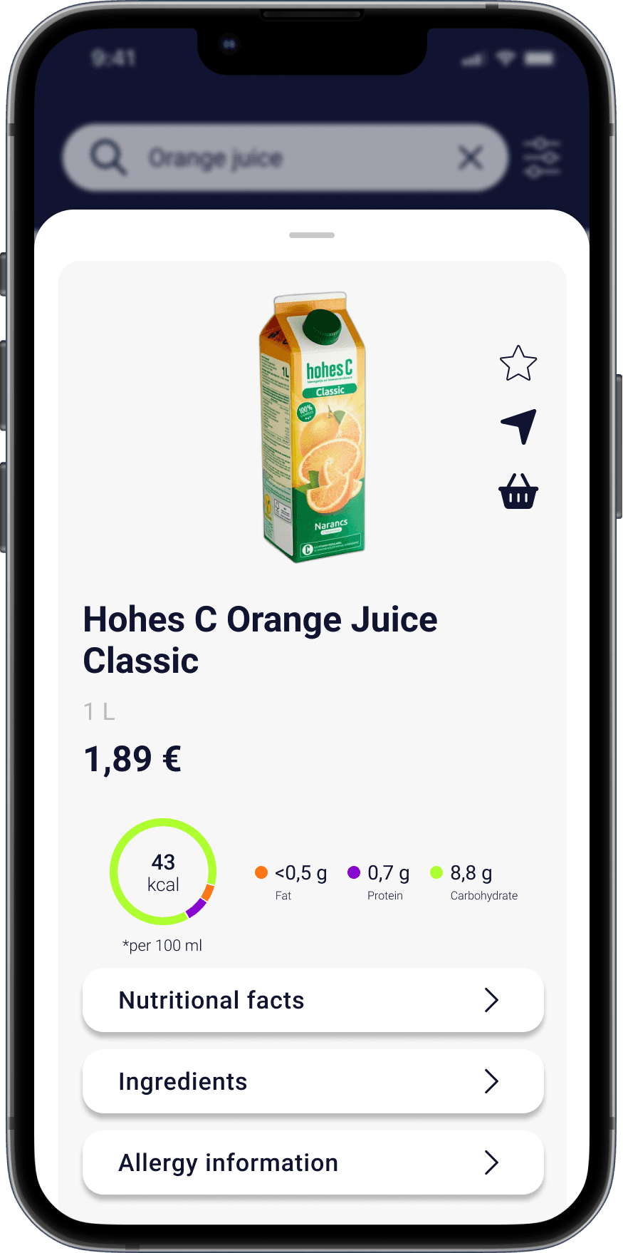
Homescreen
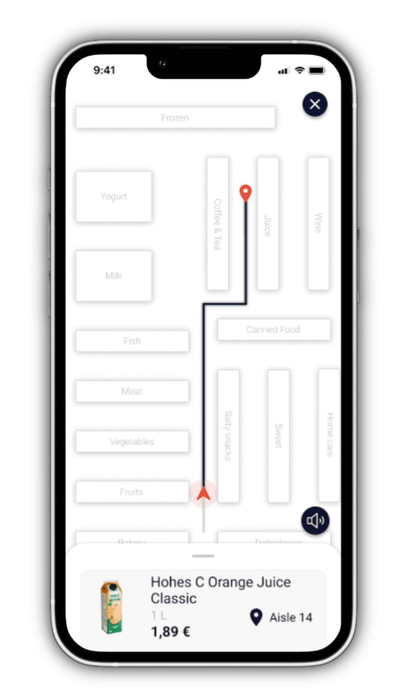
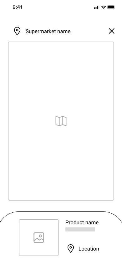
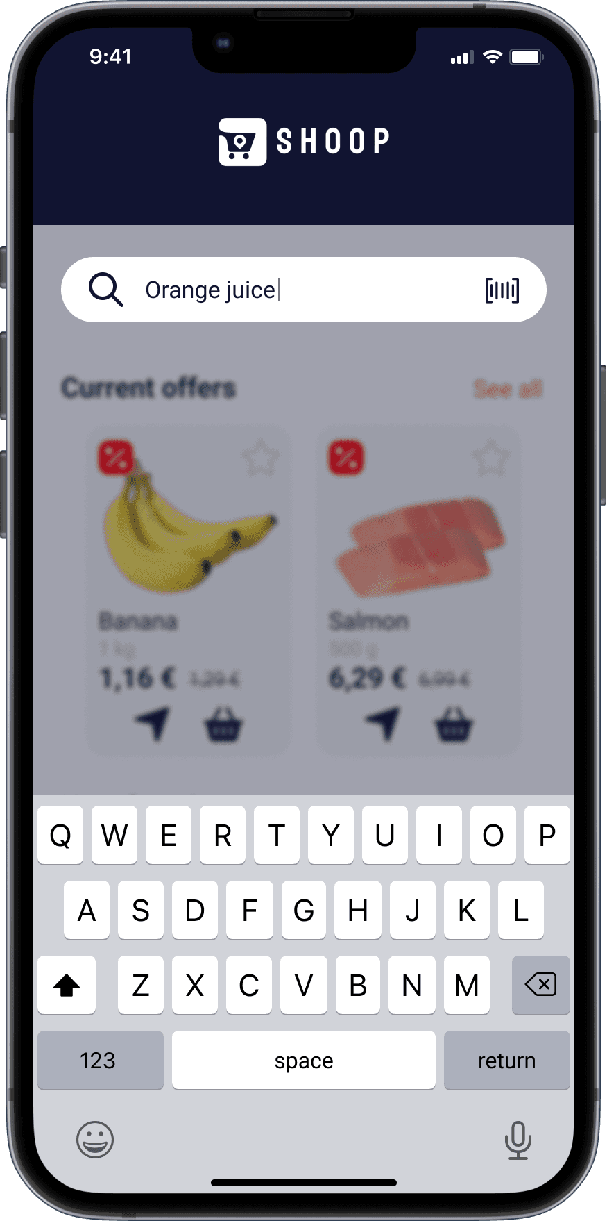
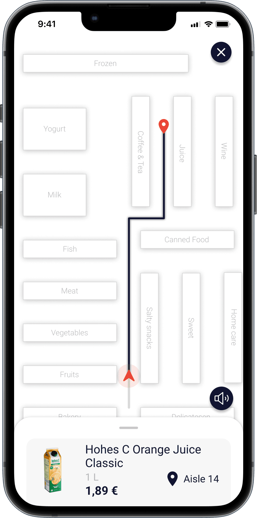
In-store navigation
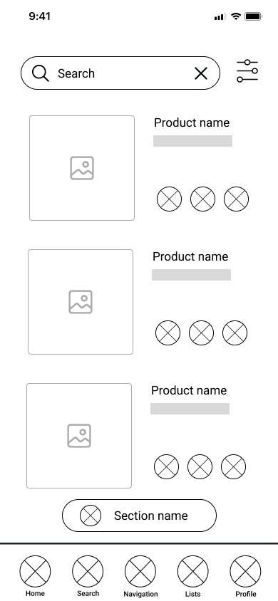
Access to product details